Start typing to search...
Docs
Guidelines and best practices
Design guidelines
Search
Koji design guidelines
Principles
Made for everyone
-
Koji should feel inviting and fun. Create templates that are easy to understand and simple to remix. Provide Visual Customization Controls (VCCs) that are useful and add to a template’s value without overly complicating it.
Familiar and functional
-
Throughout the template, text is legible, icons are clear and understandable, and animations are helpful and focus on functionality. Negative space, color, fonts, graphics, and interface elements are designed to highlight important content and convey interactivity.
UI/UX best practices
Content is mobile-first
-
Templates are designed to produce content that looks good on mobile screen sizes.
-
On-screen instructions use the mobile-first variant (for example, Tap instead of Click).
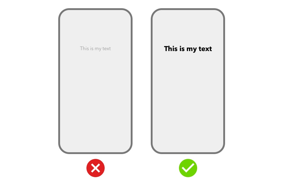
Text is easy to read
-
Keep in mind the smaller size of mobile screens and make your text large enough to easily read and understand. Ensure that primary content is clear at its default size.
-
Use sufficient color contrast for text. Insufficient contrast makes text blend in with the background. Strive for a minimum contrast ratio of 4.5:1 for body text and image text.
Fonts are appropriate and convey information
-
Choose a standard web font that matches the situation or use case of your template. Here are some example use cases and font styles that suit them well.
-
For standard text that looks like the platform text, consider:
-
font-weight: 500, 700, 900;
-
-
For memes or impact font, consider:
-
color: white;
-
font-family: 'Anton', sans-serif;
-
font-weight: 600;
-
-webkit-text-stroke: .01rem black;
-
text-shadow: 0 0 1px #000;
-
-
For presentation or formal font, consider:
-
font-weight: 600+;
-
-
For typewriter-like font, consider:
-
font-weight: 400 – 800;
-
-
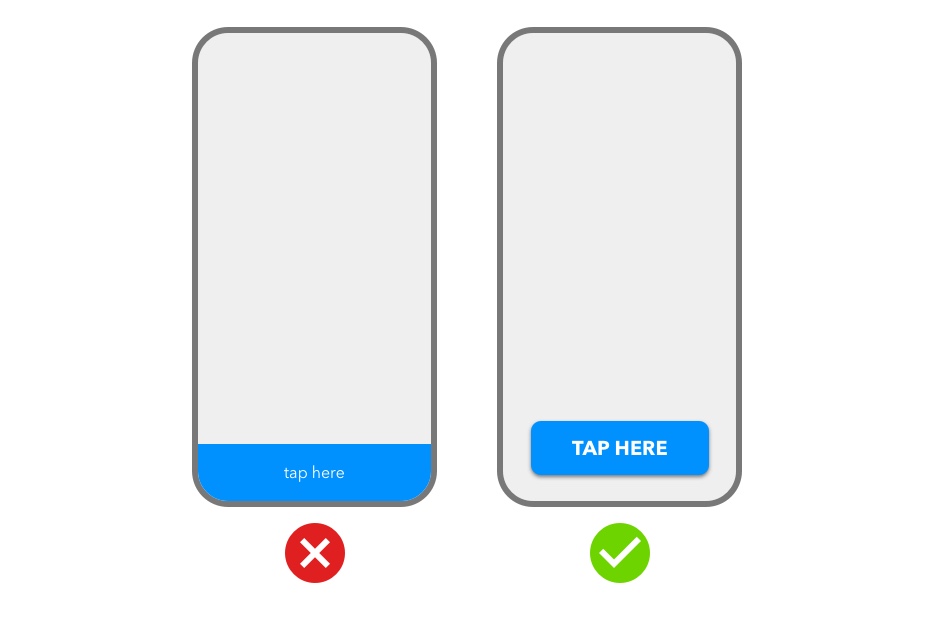
Buttons are clear and inviting
-
Design buttons and other clickable elements to attract the user’s attention and to make it clear that they can, and should, be interacted with.
-
Maintain adequate margins around buttons. A button that extends to the edges of the screen might not look like a button.
Colors are aesthetically pleasing and convey information
-
Use different colors for interactive and noninteractive elements to make it clearer where to tap.
-
Avoid colors that are overly harsh or difficult to distinguish for users with visual impairments. To help identify complementary colors, consider using an online tool such as this color calculator.
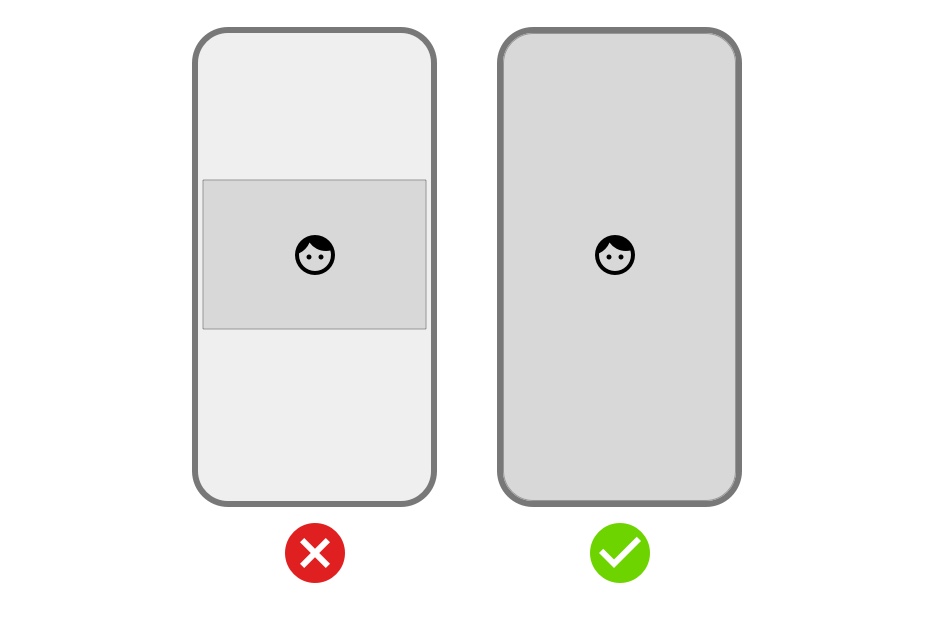
Animations are helpful
-
Use animation and motion effects judiciously. Motion should help people understand how to interact with the content, without competing with it.
-
Don’t use animation for the sake of using animation. Excessive or gratuitous animation can make people feel disconnected or distracted.
Interactive elements have large touch targets
-
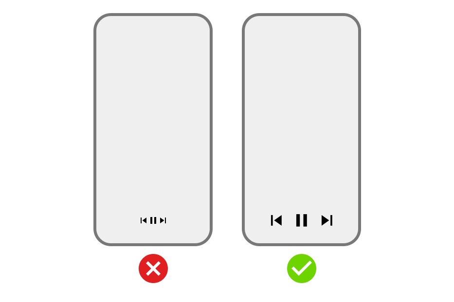
Provide ample touch targets for interactive elements so they are easy to tap using a thumb. Maintain a minimum tappable area of 44pt x 44pt for all controls.
-
Ensure that there is ample spacing between interactive UI elements.
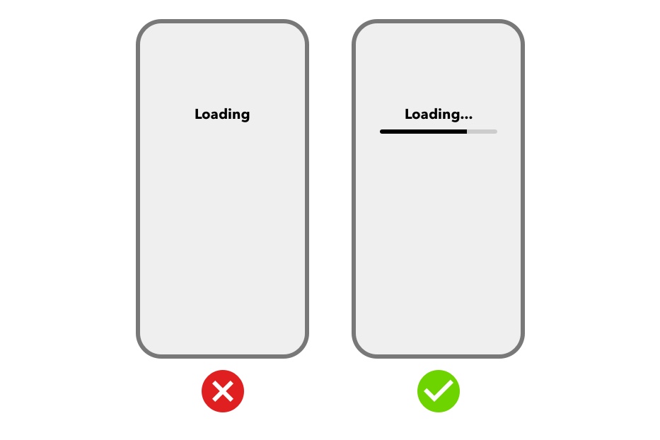
Interactive elements provide feedback
-
Provide feedback that acknowledges actions and helps users understand the results of operations. For example, if tapping a button does not provide feedback, a user might question whether the template has processed the action. A template that provides visual feedback eliminates this guesswork for the user.
-
Highlight interactive elements briefly when they are tapped, display loading indicators to communicate the status of long-running operations, and use animation and sound to help clarify the results of actions.